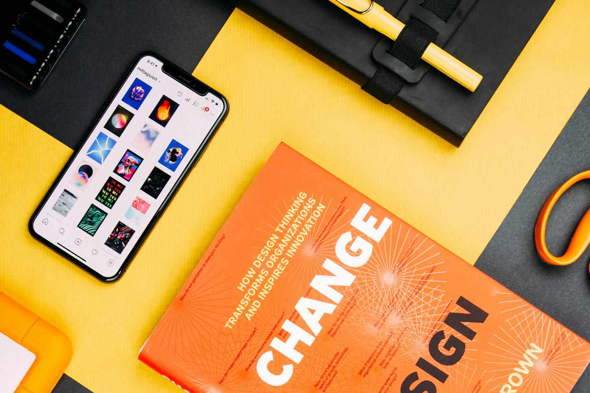
Optimize for Mobile First
In today’s world, most users browse and shop directly from their phones, making mobile responsiveness a key driver of growth. A mobile-first design ensures your website looks and functions perfectly on smaller screens, improving engagement and conversions. Fast-loading pages, easy-to-tap buttons, and clean layouts create a seamless experience for mobile users. Prioritizing readability and quick navigation also keeps visitors on your site longer. Search engines reward mobile-friendly websites with higher rankings, giving your business even more visibility. By optimizing for mobile first, you’re not just adapting to trends—you’re building a stronger foundation for lasting digital success.
Speed Up Your Site
Website speed plays a major role in keeping visitors engaged and boosting conversions. Studies show that if a page takes more than three seconds to load, over half of users will leave—hurting both traffic and sales. A fast-loading site creates a smooth, enjoyable experience that encourages people to stay longer and take action. Tools like Google PageSpeed Insights, GTmetrix, and Pingdom can help you test performance and identify what’s slowing your site down. By compressing images, minimizing code, and using reliable hosting, you can dramatically improve loading time, reduce bounce rates, and create a faster, more successful website.
Create Visual Hierarchy
Visual hierarchy is one of the most powerful tools in design—it guides users’ attention and helps them understand what matters most on a page. When done right, it not only makes your website more attractive but also improves how people interact with your content and take action.
Guide the User’s Eye
Visual hierarchy works by using contrast, size, color, and positioning to lead the eye through your design in a logical way. Headlines should stand out clearly, followed by supporting text and call-to-action buttons that invite clicks. Strategic use of whitespace and contrasting colors can make important.
Improve Comprehension and Conversions
When information is visually organized, users can process it faster and feel more confident in their decisions. A strong hierarchy reduces confusion, highlights your message, and keeps people focused on what truly matters. This clarity directly translates into better engagement and higher conversion rates. Whether you’re designing a landing page, ad, or product layout, remember: your design should always tell users where to look next. By mastering visual hierarchy, you turn simple design elements into powerful tools that drive attention, trust, and measurable business growth.
Conclusion
Growth-driven design isn’t about making things look pretty—it’s about creating intentional, simple, and data-backed experiences that inspire action. Every color, layout choice, and interaction on your website plays a role in guiding users toward trust and conversion. From prioritizing user experience and mobile responsiveness to optimizing speed and visual hierarchy, each principle contributes to better engagement and stronger results.
The key takeaway? Great design is measurable. When you test, analyze, and refine your design decisions, you turn creativity into real business growth. Whether you’re running a small business or managing a growing brand, it’s time to look at your website through a strategic lens.


